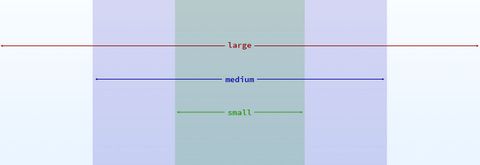
The ideal combination of media queries and grid-changes would
automatically apply changed variables at different screen widths. We can
actually see that ideal in action with CSS variables, where the change
can be scoped to DOM states, like viewport width:
:root { --columns: 2; }
@media (min-width: 30em) {
:root { --columns: 6; }
}
Because CSS variables inherit in the DOM like any other CSS property,
the effects of a variable-change propagate out to each grid element.
Here’s a more complete example of CSS-Variable grids and breakpoints in
action:
See the Pen CSS Variable Breakpoints by @miriamsuzanne on CodePen.
Sass Limitations
In Sass, variables inherit based on source order rather than DOM
structure. That means variables are not able to propagate based on a DOM
concept like viewport width. We have to apply the results of our
variable-changes explicitly anywhere we want them used.
Rather than simply setting a new variable at our desired query, we also
have to explicitly call any grid functions – like span or gutter –
that will generate new output with those new settings. We have to reset
the variables and redo the math. If we set width earlier using span
and expect that width to change, we’ll have to call span again to get
the new output:
$susy: (
'columns': susy-repeat(4),
'gutters': 0.5rem,
);
.item {
width: span(2);
padding: gutter();
}
@media (min-width: 30em) {
$susy: (
'columns': susy-repeat(6),
'gutters': 1rem,
);
.item {
width: span(2);
padding: gutter();
}
}
This is a major limitation of pre-processing, and one of the main
reasons I’m excited about CSS variables. In the meantime, there are some
tricks we can use to help simplify grid changes in Sass and Susy.
Susy-Use Mixin
We’ll need a mixin that changes our global settings for a block of
wrapped code – using the @content argument. We can pair that with a
media query to define the proper settings for a particular screen:
$medium: (
'columns': susy-repeat(8),
'gutters': 1em,
);
@media (min-width: 30em) {
@include susy-use($medium) {
}
}
Of course, Susy3 doesn’t have a susy-use mixin, so we’ll have to add
one:
@mixin susy-use(
$config
) {
$config: susy-compile($config);
$global: $susy;
$susy: map-merge($susy, $config) !global;
@content;
$susy: $global !global;
}
Susy-At Mixin
If we want to be more explicit about linking breakpoints and settings,
we can write another mixin to associate the two. Each breakpoint will
need a map of Susy settings, as well as the media query values (e.g.
min-width: 30em):
$medium: (
'min-width': 30em,
'columns': susy-repeat(8),
'gutters': 1em,
);
@include susy-at($medium) {
}
Again, we’ll have to define the mixin. There are several ways to do it,
depending on the exact syntax you want, but here’s my first attempt
(using the susy-use mixin we created above):
@mixin susy-at(
$config
) {
$config: susy-compile($config);
$min: map-get($config, 'min-width');
$min: if($min, '(min-width: #{$min})', null);
$max: map-get($config, 'max-width');
$max: if($max, '(max-width: #{$max})', null);
$and: if($min and $max, '#{$min} and #{$max}', null);
$query: $and or $min or $max;
@media #{$query} {
@include susy-use($config) {
@content;
}
}
}
Adjust for Your Project
Since this is not core Susy code, we can change the syntax however we
like to fit our individual projects and conventions more closely. If we
wanted to match the Susy2 syntax, we can rename susy-use to
with-layout, and add an argument for cleanly overriding (rather than
inheriting) the global defaults.
@mixin with-layout($config, $clean: false) { }
For the Susy2 media query syntax, we would rename susy-at to
susy-breakpoint and separate the media query from the Susy settings,
rather than storing them inside the same map:
@mixin susy-use($breakpoint, $config) { }
That’s a bit more flexible – allowing you to associate any breakpoint
with any layout configuration on-the-fly – but I’m not sure that
flexibility is very useful. In most cases, the two should remain
connected.
Your mileage will almost certainly vary, so we recommend experimenting
to find an approach that works for you.
Sharing Snippets
We’ll keep sharing snippets as we encounter them. You can copy-paste
this code and use it as-is – but we recommend playing around, and making
it fit your own project and processes.
If you have more snippets that you’ve written for Susy3, send them our
way! We love to see how other people are using these tools, and we’re
always happy to share the shortcuts you find most useful.
Follow us on Twitter, or contact us online. We’re excited to hear from
you!


